Branding
UI/UX
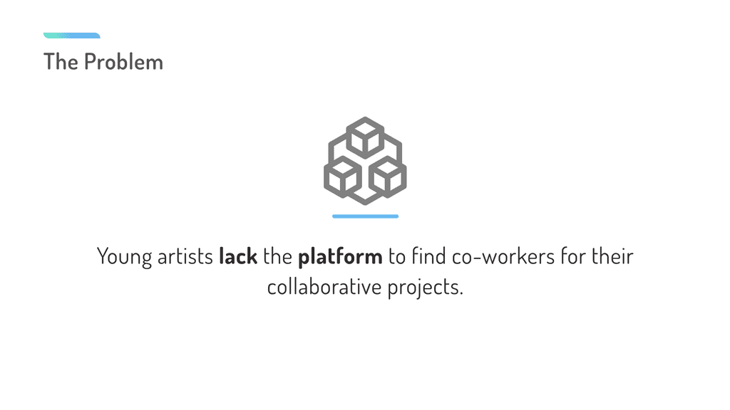
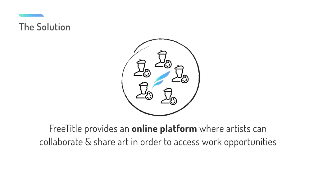
freeTitle App
Branding and UI exploration for an online artist collaboration platform
TL;DR
Company
FreeTitle
Timeline
May 2020 - Sep 2020 (5 months)
Role
UI/UX Designer
Tools Used
Adobe XD, Adobe Illustrator
Project Goal
My goal was to help the team define a distinctive tone of voice and clear brand value, then translate that into a cohesive set of visual assets that bring the brand to life.
key constraints
Limited time frame for exploration right before product pitch.
key Approaches
Brand value definition, Micro-interaction design
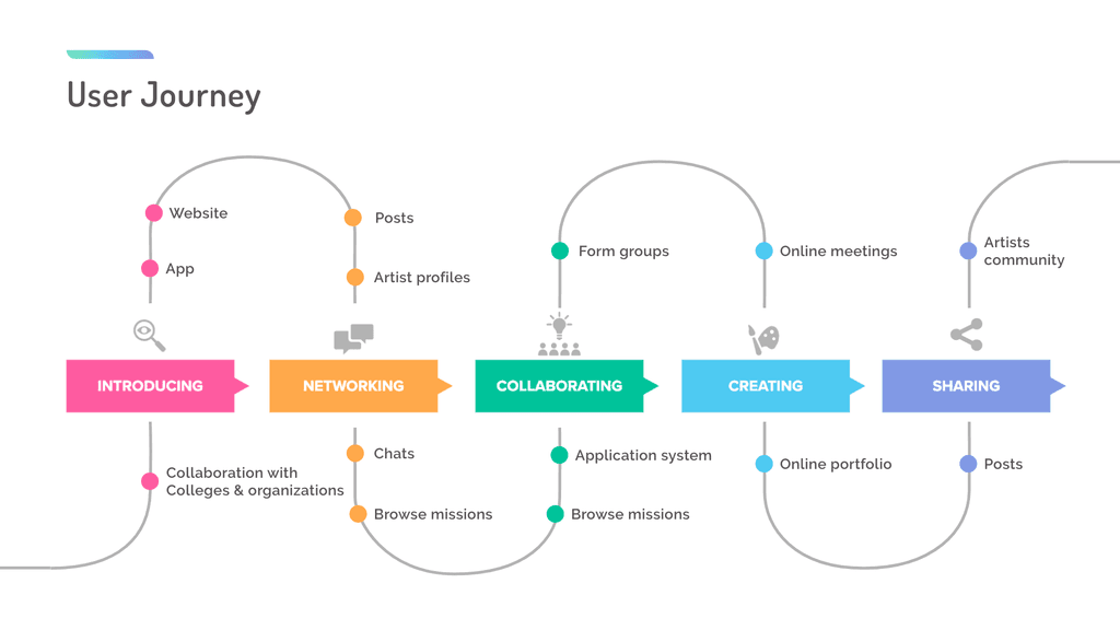
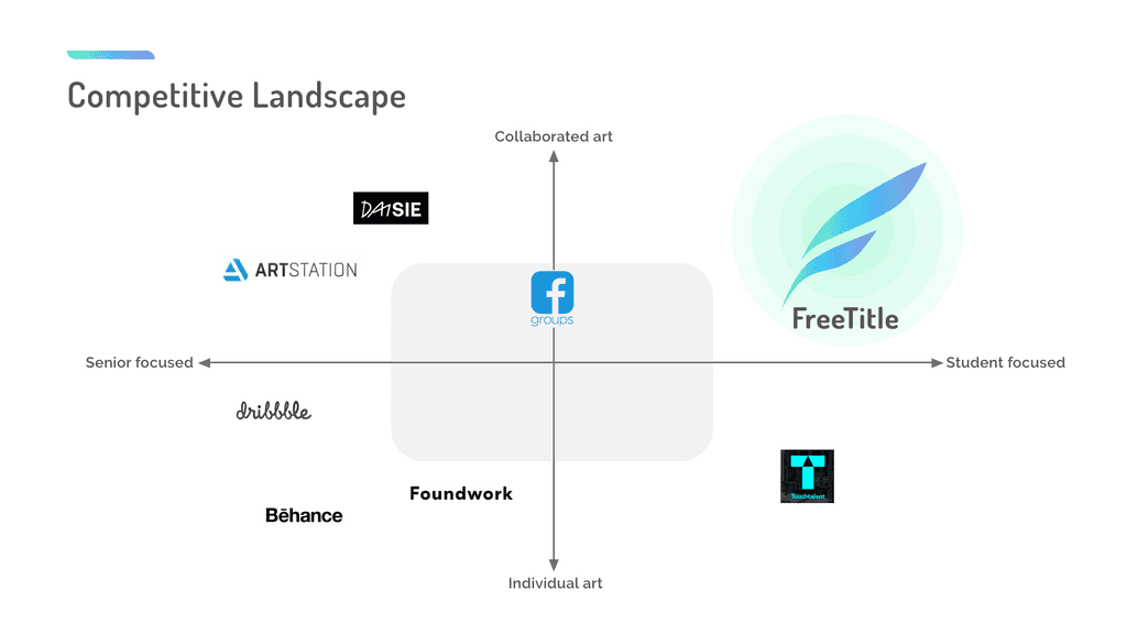
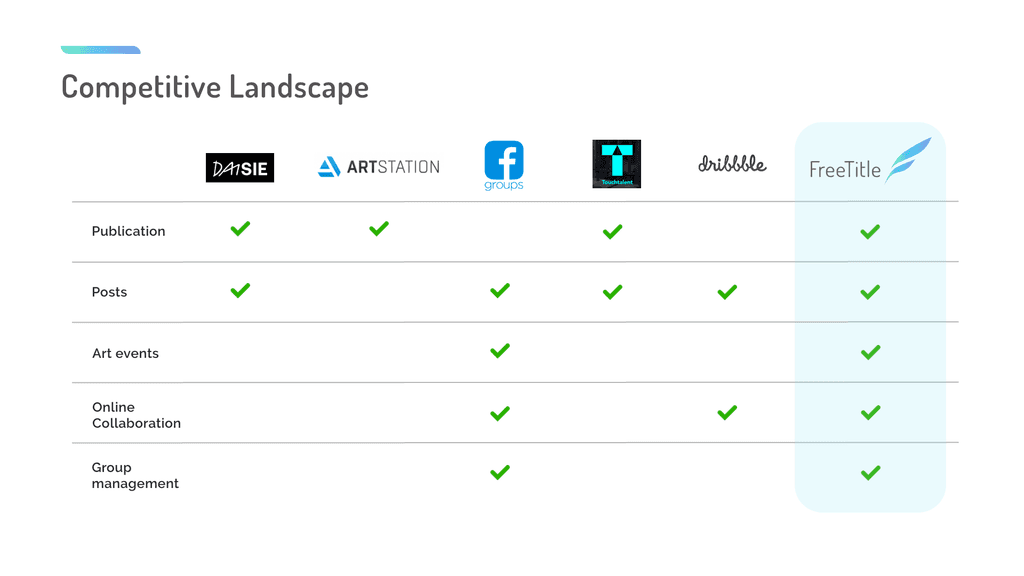
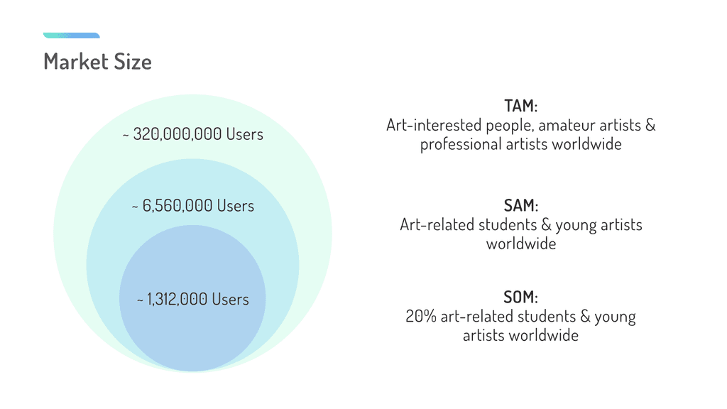
Overview
FreeTitle - A Platform for Creative Partnerships
Pitch Deck
(Tap on arrow to view)
brand value exploration
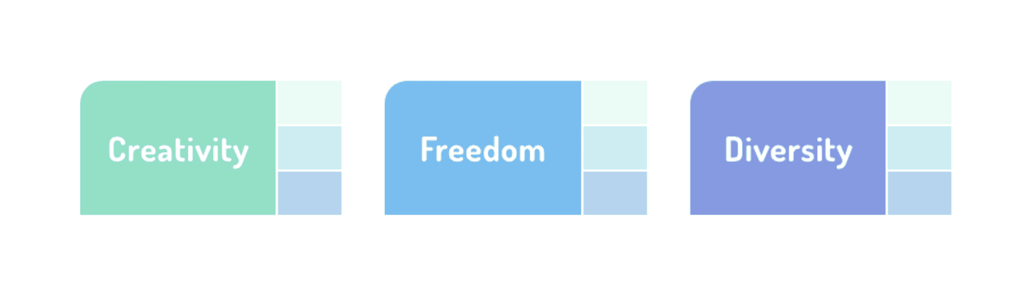
From Keywords to Core Identity
To explore and define FreeTitle’s brand value, I engaged both the team members and active platform users with a simple but insightful question:
"What three keywords do you associate with FreeTitle?"
This exercise revealed the deep emotional connections users associate with the brand, which became the later foundation for building a meaningful and authentic brand identity.
Here's the result:
Branding assets
Designing a Brand That Speaks Freedom
Color Palette
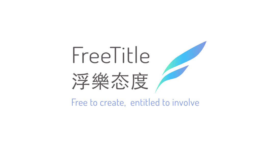
I translated the three core brand keywords into a color palette that visually reinforces FreeTitle’s identity: mint green represents creativity, blue conveys freedom, and iris symbolizes diversity. Each color was chosen to reflect the emotional and conceptual essence of the brand.
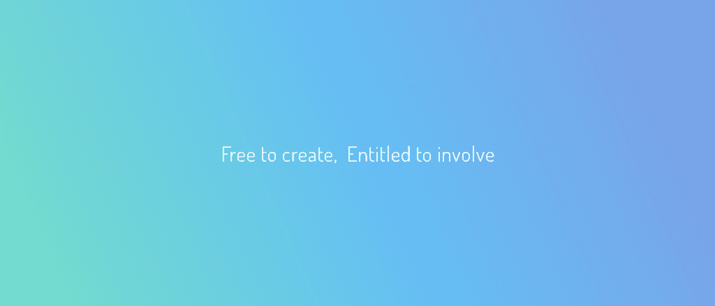
When combined, the three colors blend into a harmonious gradient that serves as FreeTitle’s primary brand gradient—visually uniting creativity, freedom, and diversity into a single, cohesive identity.
Logo
Visually echoing the shape of a bird feather, the logo symbolizes freedom and creative expression.
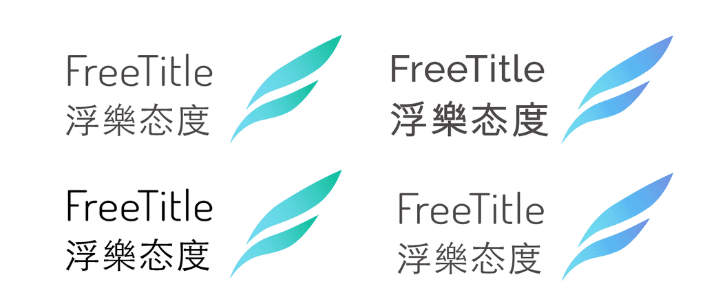
Final ver.
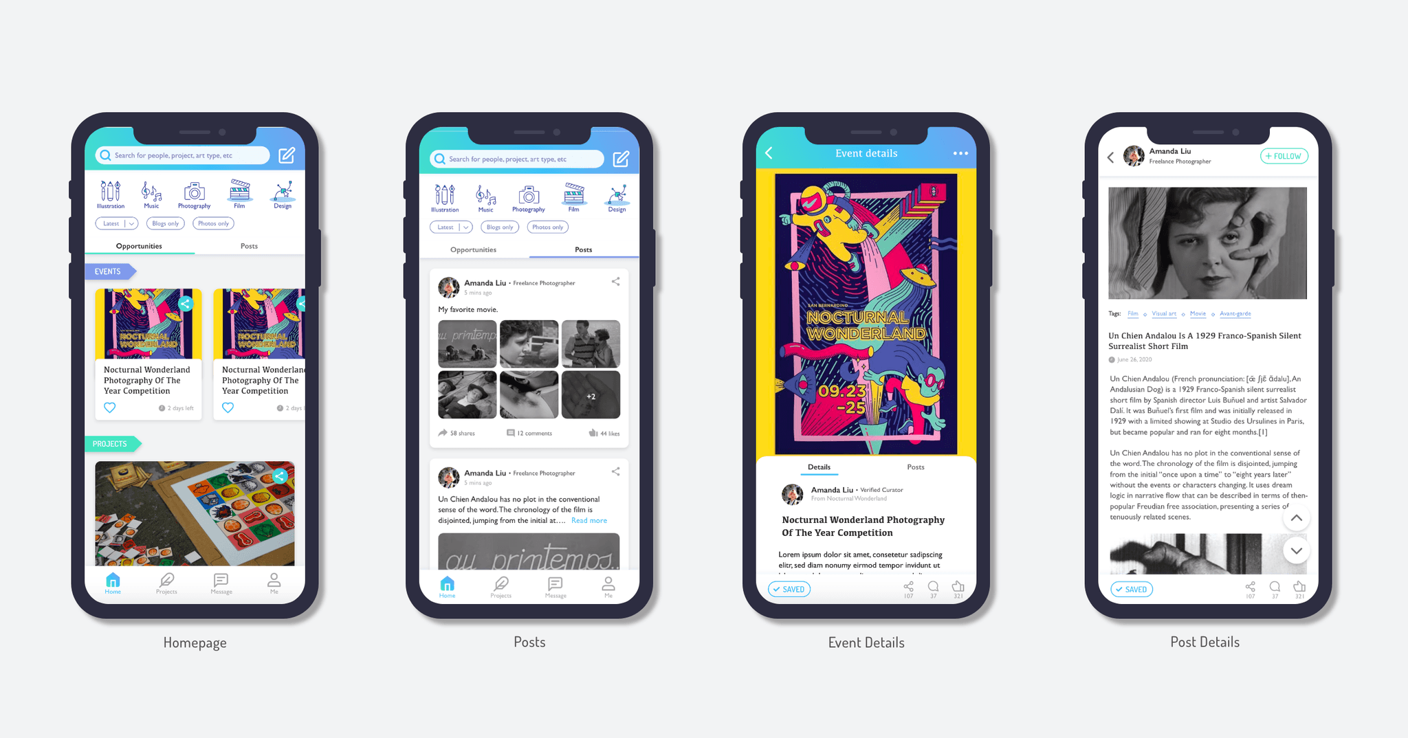
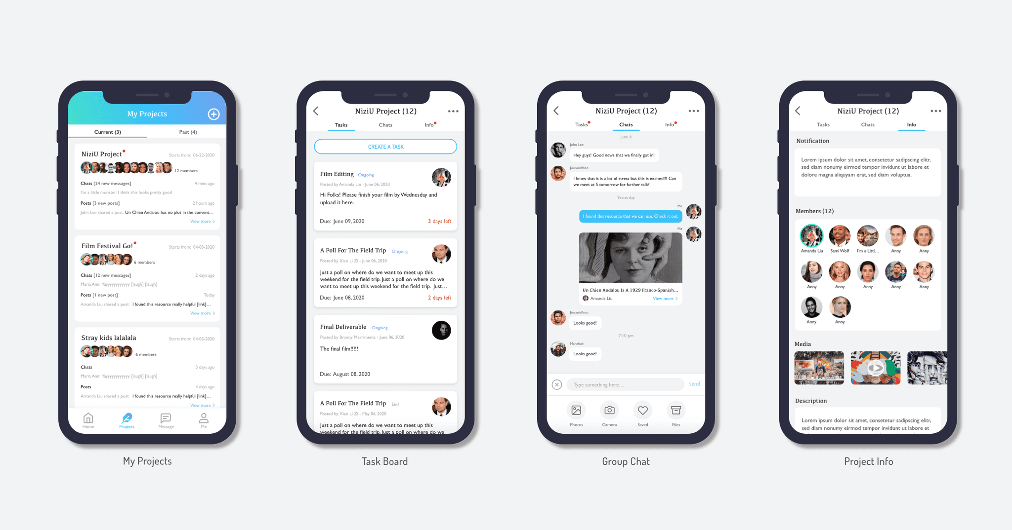
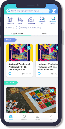
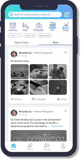
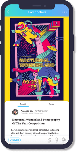
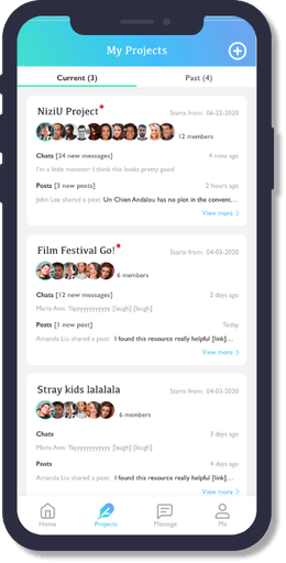
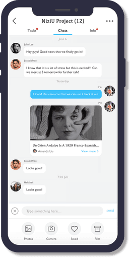
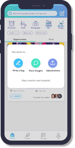
UI Design
Simplifying Complexity for Everyday Health Management
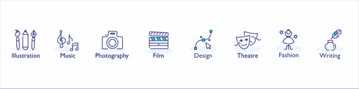
Icon Set
Final Screens